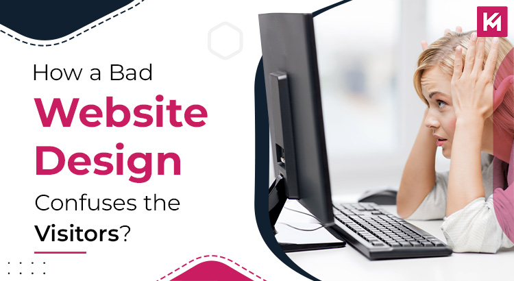
Let’s skip the cliche stuff about website design. You already know it’s important. Just answer a few questions:
Why do you have a website?
What does your website do for you?
Can you afford a bad website design?
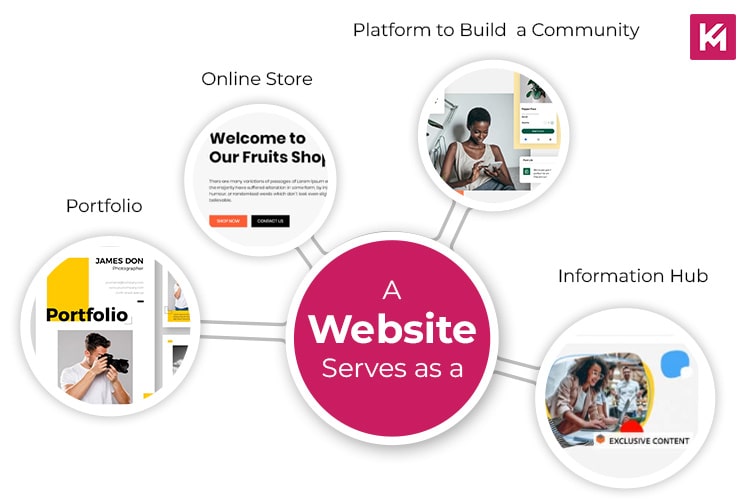
Guess what, we know all your answers. You have a website to sell stuff, showcase your portfolio, or build a community, and it’s an effective way to bring the people of your interest to you. A bad website design would irritate a reader and force him to go back, so you cannot afford a bad website design, obviously.
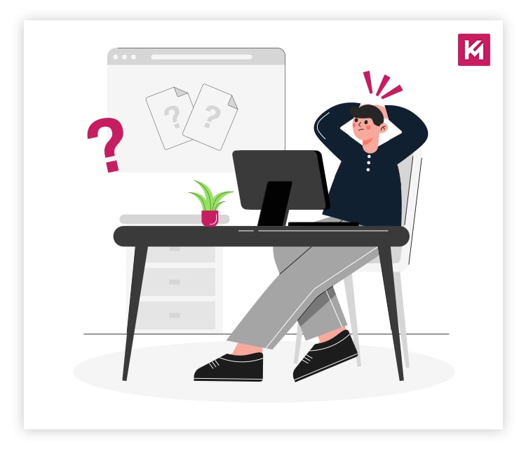
You already know this, but there are certain things you might not know, such as things that you don’t notice, that make your website really terrible for a user.
Why Do Visitors Come to Your Site?
People visit websites to buy something, learn about something, subscribe to a newsletter, or apply for something. If they fail to complete these tasks, it could be due to poor website design, potentially driving them to your competitors.
Let’s discuss some website elements that can pose the risk of driving users away?
Don’t Test Your Visitors’ Patience
You might have experienced a slow-loading website with lagging videos, broken elements, or errors while interacting with it. These issues can arise on websites built on outdated platforms or with poorly maintained code.
If a website takes too long to load, users may encounter pieces of the layout appearing at different times. This might make it hard to know where to find information or how to get around the website. According to BrowserStack, 40% of visitors abandon a website that takes longer than 3 seconds to load.
Where do you often find these issues?
These issues are most likely to occur on e-commerce websites, where large product catalogues, complex checkout processes, and heavy traffic periods (like during sales) can significantly impact performance. Also, content-heavy sites like news platforms, blogs with many articles on a single page, or visually rich portfolios may struggle with loading speeds if not optimized correctly.
Size of Images Matters But Not Always the Way You Think
If you have website of similar kind with similar issues focus on using image compression to reduce the file sizes without compromising on the quality. Choose the right format such as JPEGs for photos and PNGs for graphics with transparency. You can also consider the modern formats like WebP for even smaller files. Implement the lazy loading only to load images as the user scrolls down the page.
Create a Website with a Good Memory
Coming to website caching there are set rules for how long browsers can store copies of website files. This helps reduce the need to re-download them on subsequent visits. Besides this, you can store a per-generated version of your website’s page for faster delivery to users.
When Traffic Gets Heavy, Content Delivery to the Rescue
To effectively manage the surge in traffic and minimize loading time, use a content delivery network. It keeps duplicates of your website’s stuff on servers worldwide, so users can get content from the nearest server.
Navigation
Navigation Nightmares refers to the challenges and negative impacts associated with poorly designed website navigation. Website navigation serves as a roadmap for users, guiding them to find desired information or complete actions easily. When navigation is clear and intuitive, visitors can navigate effortlessly, whereas confusing navigation can leave them feeling lost and frustrated.
Confusing menus are a hallmark of bad navigation. Following are some key issues a visitor might find confusing:
1. Disorganization
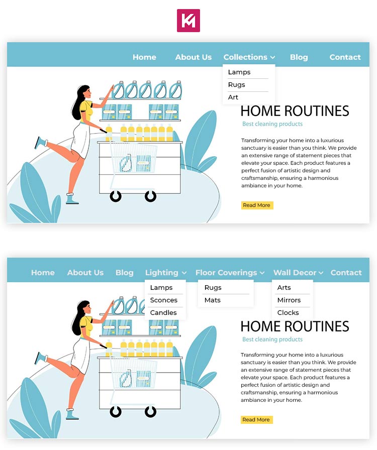
When items are scattered without logical grouping, it is difficult for users to scan and locate specific content. Let’s understand this with the help of an example: an e-commerce site sells home decor items. Its navigation menu has lamps, rugs, and art. Now, this lacks organization. If you’re searching for something specific such as a vase, you might have to check multiple categories to find it. This can be frustrating as it takes longer to find what you want.
2. Lack of Hierarchy
Menus lack a clear structure, such as main categories and subcategories, which hinders users’ understanding of how content is organized. Here is an example that can help you understand this better:
Let’s say you are on a travel website. It is comprised of “Destinations,” “Things to Do,” “Travel Tips,” and “Blog” sections. But, for instance, you are interested in booking a hotel in Paris. It is not known where to find that information under “Destinations” since it might focus on general information about the city. If they had a dedicated “Hotels” section or a sub-category within “Destinations” for “Accomodation,” it would be a lot easier to locate what you’re looking for.
3. Inconsistent Labeling
Never use vague, misleading, and overly technical menu terms. If you have a restaurant website, your category should be “Appetizers,” “Main Courses,” and “Desserts,” and not “Culinary Creations,” “Gastronomic Delights,” and “Epicurean Experiences.”
4. Overwhelming Number of Options
Too many choices in the main menu can also overwhelm users. Let’s understand how. A recipe website has a lot of categories on its main menu like breakfast, lunch, dinner, snacks, desserts, appetizers, drinks, vegan, vegetarian, and gluten-free. This can overwhelm users and make it tough for them to begin searching. It suggests that some categories like “Vegan” and “Gluten-Free” could be grouped under broader sections to simplify the menu.
All these issues can significantly degrade the user experience.
Disorientation
While disoriented layouts may look artistic they are not recommended generally. Know why:
Psychology of Symmetry
Studies have shown that human brain have natural preference for symmetry and order. Titled layout, text or images can mess with their comfort and create a sense of unease.
Ever scrolling Content
Eye-tracking studies by NNGroup reveal that most users only focus on the top half of a webpage when scrolling. Content placed below the fold (area requiring scrolling) has a significantly lower chance of being seen. Ever-scrolling content can bury important information past this point.
Inconsistent Navigation
Nielsen Norman Group’s (NNGroup) Jakob’s Law of Learnability states that users prefer interfaces that are consistent and predictable. Inconsistent navigation directly contradicts this principle, making it difficult for users to learn how to navigate the website.
Impact
Studies by Unbounce suggest that a well-designed website can increase conversion rates (desired visitor actions) by up to 200%. Disorienting layouts would likely have the opposite effect, driving users away and hindering conversions.
Confusing Your Visitors with Mixed Messages
Ever visited a website that looked great but left you scratching your head? You don’t get that, whether it is a store, blog, or social media profile.
1. The Multi-Purpose Design

When a website integrates features from various functions, such as e-commerce elements, alongside blog posts and contact forms, with so much overload of features, a visitor may feel lost. It can be hard to comprehend the website’s main objective or intended use.
2. The Hidden Button Blues
Calls to action (CTAs) are like big signs telling visitors what to do. But if they’re missing or hard to spot, visitors get frustrated.
The result?
Confused visitors leave, and you miss out on potential customers or followers. If you don’t want design in the way of your opportunity, make sure to:
- Focus on clarity: Despite offering wide range of products or services, be very specific about the main objective of the website. Put out clearly why the customer should consider and choose your offerings. When the website has a clutter free design, people are more likely to find what they need.
- Highlight CTAs: Use large, clear buttons that specifically call visitors for action.
- Test and improve: Understand the user activity on your website. Set the site up to be easier and more efficient.
The power of your website is increased if it is consistent; it becomes an immaculate and attractive place.
Wrapping Up
So, that’s all. Now you know how to design a website that feels like a welcoming space. For inspiration, you can research the best practices and apply them. However, if this seems like a hard-work, stay connected with Kinex Media. We’ll provide you with the latest and most effective strategies to ensure your web presence.