Ever wondered who’s on the other side of your mobile screen when you shop online? Creating a mobile e-commerce website helps you understand your audience. It also connects you directly to the preferences of online shoppers. This blog will present much needed insights into mobile eCommerce and the tips needed to excel through it.
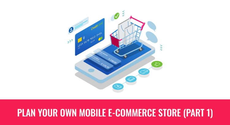
Key Questions in Planning a Mobile E-commerce Website
Target Audience: Who’s on the Other Side of the Screen?
Determine your mobile audience’s preferences and demographics.
Measuring Success: What Defines Conversion?
Give specific quantifiable objectives that can be used in monitoring the effectiveness of your mobile strategy.
Design Factors: What Makes a Click Convert?
Ensure that you emphasize on design elements that contribute to higher conversion rates on mobile phones.
Ideal Product Page: Crafting the Perfect Showcase
Make your product pages clear, easy to respond to, and visually appealing.
Understanding the Mobile Customer
- Think of different situations involving phone use and users’ perspectives.
- Identify different mobile shopper types: bargain hunters, deal seekers, social shoppers, and window shoppers.
Measuring Conversion Success
- Measure success in terms of number of purchases made, number of social promotions, or completed tasks.
- SMART set of goals for tracking and measurement of achievement.
Design Factors Affecting Mobile E-commerce
-
Hierarchy and Navigation
Use off-canvas navigation to prioritize the features.
-
Imagery and Photography
Make it load fast using several products images optimized.
-
Typography
Make sure it is readable, responsive and well-spaced out.
-
Finger-Friendly Design
Increase the size of the important action points to make them easier to press.
-
Contrastive Color and Light Conditions
Ensure a good contrast on button as it might be darker when they are not in sunlight.
-
White Space and Encapsulation
For simplicity, use white space; for emphasis, encapsulate with white space.
-
Copywriting
Be cognizant of limited mobile screen space and employ persuasive language as a result.
-
Forms
Ensure that forms are finger friendly and readable with directional markers signifying progress through them.
-
The Ideal Product Page
Titling, fonts that respond, and corporate color palette.
Price in a contrasting color, clear call to action, and comprehensive product details.
Importance of Mobile Optimization
- In addition, mobile-friendly sites allow for easy shopping hence they contribute to better ranking in search engines.
- Convenience and discounts make millennial and Gen Z consumers drive online shopping.
Key Strategies
Page Load Speed
Utilize the testing speed of the Google’s tool and eliminate the lost revenue.
Clear Calls to Action (CTAs)
Use contrasting colours with strong CTA wordings in short sentences.
Optimized User Experience
Make mobile experience easier, speedier, and more user-friendly.
Streamlined Checkout
Eliminate extra actions, support a spectrum of payments, and connect with social media.
Integration with Social Media
Use platforms such as Pinterest and Instagram, especially for social selling.
Promotions and Discounts
Targeted promotions and discounts need to be tracked and analyzed for traffic purposes.
Advantages and Limitations of Mobile E-commerce
Advantages
- User-friendly experience.
- Cost-effective and SEO-friendly.
- Consistency across devices.
Limitations
- Possible slower downloads.
- Time-consuming development.
Mobile Optimization for eCommerce
Tools assess mobile-friendliness for image loading, text visibility, page speed, and pop-ups.
How to Optimize Your eCommerce Store for Mobile?
Design Elements for Success
- Minimalistic design for speed.
- Grid layout for structure.
- Balance of white space for an enjoyable user experience.
Improving Use and Navigation of Mobile Shopping Sites
Ensure that search bar is perfect, restructure the main menu, and organize product categories in a logical manner.
Mobile eCommerce Examples
Learn from Amazon, eBay, and ASOS for efficient browsing experiences.
Mobile-Based E-commerce
Carry out buying and selling through a mobile site or app.
Creating a Mobile-Friendly Website
Ensure responsiveness, intuitive navigation, and optimized performance.
Mobile vs. Web eCommerce
Transactions on mobile devices vs. desktop/laptop.
Essential Features for Compatibility
Mobile friendly, fast speed website, readable text and interactive user experience.
Improving Performance
Pay attention to the responsive design, low time of loading, intuitive navigation, legible text, as well as optimally used visual materials.
The Significance of E-commerce Mobile Apps
Convenience and Speed
The customers are now preferring mobile applications for ease and speed, expecting convenient shopping experience right on their fingers tips.
Competitive Advantage
Businesses that have apps are more than five steps ahead of those without leading to greater convenience and increased interaction.
Marketing Communication
Notification push is a way of enhancing the advertising information on promotions, discounts and new products.
Enhanced KPIs
On the other hand, mobile apps boost some of the key performance indicators (KPIs) that enable tracking and optimizing business performance.
Personalized Shopping Experiences
This helps build customer loyalty that customizes recommendation according to user preference and behaviours.
Improved Customer Service
Positive user experience enhances goodwill through an engaging environment and customer satisfaction.
Steps to Build a Successful E-commerce Mobile App
Market Research
- Ascertain the app’s domain, intended users, and USPs.
- Knowing what drives different consumer behaviors within an industry is essential.
Competition Research
- Analyze your SWOT against that of your competitors, including assessing strengths and weaknesses.
- Selecting carefully on battles depending on the budget.
Platform and Technology Selection
Choose whether to develop a native or a hybrid app including customer experience, features, timing, cost, and sustainability.
CMS Selection
- Consider an app-ready CMS like Magento, WooCommere, Shopify, Contentful or Prestashop.
- A mix of both independence and dependence on the developer is best illustrated by a balanced hybrid CMS.
Listing Essential Features
Secure login, product catalog, shopping cart, and mobile payment solutions.
Investigate higher level characteristics such as wishlist button, improved search, QR code/bar code reader, mobile, scoring, feedback, one click shopping, etc.
UI/UX Strategy
- Easy login, simple check out and user-friendly gestures should be prioritized.
- Demonstrate security mechanisms to reduce buyer mistrust.
- Get abreast with the latest UI/UX trends to ensure best customer experience.
Cost Estimation
- Depending on the type of features and the cost per developer, app development can go between $15,000 and $135,000.
- Apps with many features and superb designing require more development hours or expenses.
E-commerce App Builder vs. Custom App Development
- Tailor-made solutions, better performance and more effectiveness through custom app development.
- They are cost effective but they might be basic with limited ability of customization.
Check out these blogs to learn more about how to optimize your digital presence:
CHATGPT V/S BARD: WHICH IS BEST?
HOW CAN SMALL BUSINESSES MAINTAIN STRONG SOCIAL MEDIA PRESENCE?
Mobile Commerce Trends in 2023
Sales Projection
By 2025, mobile commerce sales in the U.S. are projected to amount to over $710 billion.
M-commerce Contribution
It is predicted that m-commerce will account for almost half, or approximately 44%, of all online transactions by 2024.
AR and VR Growth
According to a study, the AR and VR industry will amount to $35 billion by 2025.
Chatbot Retail Spending
Chatbots are expected to provide consumer retail spend of $142 billion by the year 2024.
Conclusion
Amidst the ever-changing mobile e-commerce world, success is uncovered through simplicity and connection. From understanding the audience to mastering design factors, the journey navigates key strategies and emphasizes user-friendly experiences. Mobile apps offer convenience and personalized shopping, while trends predict a surge in mobile commerce. In essence, the path to success lies in simplicity, connection, and adaptability to emerging trends.