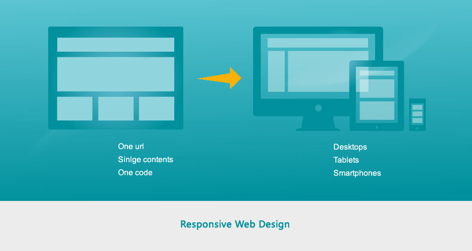
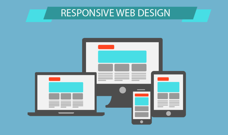
Reliability on digital design has helped designers and developers use the widest variety of tools to deliver content to the public. It has helped them provide a consistent interface for various devices without the need to hold separate versions of the website.
This has also removed the need to fix the negative inconveniences created by conventional approaches such as scaling and dynamic layouts. In this blog post, we’ll highlight the top 3 errors that most designers find while dealing in responsive web design and solutions to each of these errors.
Tug Of War: Scaling Vs Fluid Vs Responsive
Designers sometimes get confused when referring to such words, which eventually lead to incorrect use. In fact, these are intermediate steps for the layout technique which has eventually evolved due to technological advancement.
The aim of the scaling layouts is to scale up the elements. They are highly sensitive, as they dynamically scale the content according to the device being used to adjust the size. The architecture stays unchanged; the scale of the elements is the only aspect that varies so that the website appears to be compatible with the computer being displayed.
What makes fluid layouts different from others is the fact that they balance the container elements as per the device they are being viewed upon. Several relative units are being used to bring the effect such as ‘ems’ are used to overcome the shrinkage related problem.
The user can scale the design to break it. In this case, readability is there but the consistency is missing.
In contrast to scaling and fluid layouts, responsive layouts do not perform any sort of scaling nor do they change the container size as per the size of viewport.
Disaster 1: Wrapping Menus
With a responsive interface, navigation bar at the top of the page is snapped most of the time. It is achieved so that even though the website is viewed on a smaller screen it suits in a compact format.
Though, you can’t expect this to work completely in cases where it only seems small enough to show the menu items within a single line, even though the display area is larger than the break point. What comes out as a final result is wrapping.
But wait, we’ve got some ideas to fix this dilemma going your way. The first approach is to reduce the number of things displayed horizontally on the navigation panel.
That will happen if you group them according to categories and sub-categories. For show the sub-categories within a specified category, drop-down items can be further used.
An alternative to this is to shift the break point to a lower value. You should use a number that matches the width at which the navigation bar starts failing, rather than using a particular device dimension. Last but not least, you can consider using another menu for the apps, like a sliding drawer for example.
Disaster 2: Use of Images with Fixed Widths
Through responsive design, the areas of content are set according to a scale relative to the computer it is presented on. If a fixed-width image is projected over an area smaller than its height, it will get cropped.
This problem can therefore be solved by using the relative units to set the image distance. Else, if you are using a framework such as Bootstrap, all that you need to do is to make use of a responsive image class.
Disaster 3: Distortion of Elements
It can seem hard to grasp but is sometimes done when the model is seen on a smaller screen. What happens in this situation is that all the unhandled columns function as rows. It is caused primarily by material distortion, which further changes the order of the whole website design.
The remedy for the lesser people is very easy but known. Everything you need to do is set the web elements specifically to their height , width and padding.
In case the elements you might be observing push elements out of the present place and cover other elements. Nevertheless, by wrapping it in a div and setting margins, you can limit it just like where it is.
An efficient responsive website will not only help in keep the visitors happy but will ultimately lead to rise in conversions. For better conversions through your mobile website, read our post, “ Three Tips For High Conversion Mobile Experience“.


