


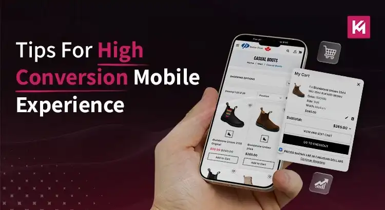
6 Tips For High Conversion Mobile Experience
The number of customers shopping over smartphones and tablets has increased drastically over the last few years. However, the stats are catching up faster than you think. To think about all of the people buying over mobile and related devices, your site must deliver the right vibes to the users.
While holding their tablet or mobile, thoughts such as ‘wish there could be a mouse,’ should not cross the user’s mind even for a second. And this is only possible when you optimize the user experience of your website for mobile devices.
To ensure that you carry it out perfectly, we’ve crafted a detailed blog post listing six tips for a high conversion mobile experience. So, let’s begin!
Here are the top six tips for improving the user experience while leading to high conversions.
Keep It Quick & Smart
Quick browsing is something that every shopper expects while shopping. People consider the smartphone as an escape from the boredom caused by meetings while travelling or while waiting for their turn to come to a clinic. People utilize this time for reviewing emails, surfing social media platforms, and of course, browsing deals on shopping portals.
In most cases, people visiting the mobile site to pass the time prefer to read reviews and referrals rather than buy anything. For such users, you need to deliver a shopper experience tailored to grab the attention of people on the go.
You can get a great amount of attention by keeping the product images as large as possible. Alongside this, incorporate in-line zoom and spin features and allow navigating the products through gestures such as swiping. To enhance the user experience, you will need to keep the “save” or “add to cart” button visible on the screen. Due to this, customers can save their favourite items for later purchase. Hence, making your customers’ browsing experience quick and smart.
Provide Detailed Product Description
Most users navigating the site on a tablet or laptop are relaxing while looking for something that might catch their eye. Alongside this, it has been evaluated through several surveys that the traffic from tablets is steadily increasing. The user engagement on tablets is following the footsteps of laptops and desktops. That is why marketers should understand how to adapt the experience for tablets so it comes close to that on laptops. You can get customers’ attention through the large screen for showing a video gallery or giving a detailed view of the product.
You can make the experience more engaging through the use of features such as 360-degree spin and zoom. It could be helpful when the customers have saved a product and want to review it later for more details. You can add a video explaining the features of the selected product. It is best for all those tablet users who are looking for that extra edge.
Gear Up for Future Trends
Considering the competition existing in terms of responsive design, developers have managed to come up with innovative features such as using the smartphone for scanning barcodes, looking up reviews or comparing prices while shopping.
Try to incorporate the features that shoppers expect from online shopping. Make sure that you display targeted offers, such as related or recommended products, so that the purchase can be completed. Provide product recommendations from the inventory based on the shopping history of visitors. Come up with something out of the box, such as an app that lets you know which products in the store were scanned and which offers the shopper is viewing. In this way, you can assist the shoppers in finding related items.
Optimize for Micro-Interactions
You need to understand that mobile conversion isn’t only about minimizing things but also about making them much more accessible. It’s because contemporary mobile phone screens have a considerably longer length than those of yesteryear versions. However, most users still browse by using a single hand.
If you want to prevent your users from getting frustrated, you need to design within the Thumb Zone, which is the natural arc a thumb makes on a screen. As a matter of fact, high-value actions like “Add to Cart” or “Proceed to Checkout” buttons must be anchored to the bottom third of the screen.
Moreover, you should include subtle micro-interactions to provide instant feedback. When a user taps a button, a slight vibration or visual loading pulse will confirm that the action was registered.
Utilize One-Tap Payment Ecosystems
Did you know that it is at the mobile checkout where most conversions fizzle out? It is mostly because of the fat-finger syndrome of typing long credit card numbers into small fields.
If you want to tackle this, your mobile strategy should integrate different digital wallets. These one-tap solutions will bypass the traditional multi-step form-filling process. They will do so by utilizing the biometric security, which is already stored on the user’s device.
Thinking from a conversion psychology standpoint, the less time a customer spends in the transactional phase, the less time they will have to think about their purchase. So, reduce the checkout process from minutes to seconds and see your sales surge.
Carry Out AI-Driven Hyper-Personalization
Nowadays, a static mobile website is a dormant one. In case you really want to get high conversions, you need to implement real-time personalization, which mirrors the sophistication of the Generative Engine Optimization(GEO). It involves leveraging AI to properly reorganize the mobile homepage as per the user’s intent.
If you think beyond the simple recommendations, you need to use predictive search bars which suggest the right products even when just two characters are typed. It is important for mobile users who want to get rid of excessive scrolling. By integrating structured data that AI search engines can interpret, you will be able to ensure that your on-the-go deals are showcased accurately in AI-driven mobile summaries and voice searches.
Wrapping Up
To transform your mobile website from a desktop version into a high-conversion engine requires you to change your perspective. It’s because the contemporary mobile shopper is looking for an experience which will respect their time and their need for a frictionless journey. So, in today’s competitive landscape, mobile optimization is a continuous commitment to speed and intuitive design. Follow the above-mentioned tips and ensure a high conversion mobile experience.
