When referring to the website design, doubts that an individual holds vary greatly. It is because the reasons for creating a website differ from person to person. With that, everyone has a different definition when talking about perfect website design. However, regardless of one’s description, here are five proven tips for website design.
The principals
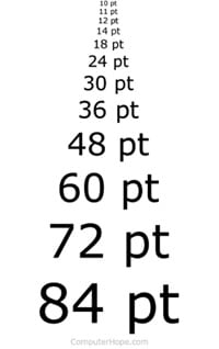
Principal 1- Using Small Fonts
Back in days, most of the websites used to depict small font size near to 12 pt. With the increase in screen sizes, the standard sizes have changed. You cannot expect reading 12pt font over a 24 inches screen. For web design, the text’s font should complement its design, structure, and images. Besides, the type of font to use must be at the forefront. Preferably not at the end of the design process.
With that, the selected font must ensure that the text is readable, user-friendly, and complementary. Arvo, Merriweather, Dosis, and Helvetica are some of the commonly used fonts.
Here are the tips you should consider while setting the font size.
- Make use of multiple headlines in the content
- Use the large font for the headlines
- The body fonts should be readable from the minimum distance that has to be maintained between the reader and the screen.
Principal 2 – Excessive Moving Sliders
If you ask a smart marketer, he would never appreciate the idea of displaying your website content using moving sliders. Too many sliders straight on the homepage tend to make it difficult for the visitors to focus on the desirable content. Waiting for the next slider to come, makes things even more irritable.
Avoid using image carousels and sliders since the user needs to be in control. On a sad note, many users report the worst usability with carousels because they often move too quickly and have small navigation icons. For that matter, the best user interface design facilitates control from the user’s side.
Make sure you consider the following things when designing your website structure.
- Adding sliders just because others are doing it would never help.
- Keep the homepage high on information that is easy to access.
- Choose limited offers that you wish to display as banners over the A-space of your homepage
- Some eCommerce sites use rotating offers
Principal 3 – Using Long Sentences
A common mistake that most of the websites make is creating lines that run too long. As specified by ‘The Baymard Institute,’ the optimum length is 50 to 60 characters per line, with the maximum acceptable characters being 75.
Lengthy lines hamper the reading experience. This problem is faced, especially with respect to the responsive design. With you not knowing the width of the content section, you will never be able to see the length of lines because of the varying screen sizes. Web design sentences must be kept precise, and in this way, readability is prioritized. Note that long sentences compromise the meaning of the sentences.
Concerning Sentences
- Be precise.
- Make meaningful sentences.
- Focus on grammar.
- Create engaging content.
- Do some research before writing.
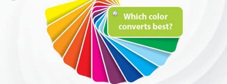
Principal 4 – Colour Scheme For CTAs
A few internet marketers understand the essence of utilizing highlighting colours to create impressive Call-to-action (CTA) buttons. You want to draw attention to the primary CTAs. Using colours that follow the same colour scheme as the footer and header are never going to help.
Colours create a distinctive look, and this increases engagement and user attentiveness. Note that colour palettes vary from web design to web design, but call to action buttons should offer a healthy contrast.
The thumb rules for choosing colours for CTAs:
- Use bright and striking colours.
- The colour should be complementary with the other colours used over the website.
- The colour should never match the colour of the background.
- Use the colour in a way that it does not get overused or looks too familiar.
Principal 5 – Stories through a Gallery
Modern web design offers a sensation through media- images and videos. Incorporating images or photos in the web design transforms the layout to something classic and alluring. On the other hand, it tells the story entirely in the shortest time possible.
Embed photos in a way that suits the layout rather than filling up white spaces or for the sake of using them.
Vital Tips for Media
- Stock photos won’t work even though attractive
- Rule out clusters
- Use images where necessary to illustrate a concept- with a purpose