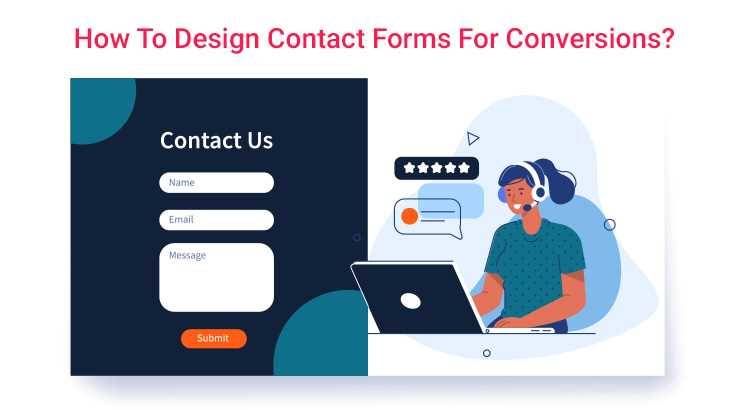
How To Design Contact Forms For Conversions
An excellent form is essential for engaging with high-potential clients. A form with an unaesthetic appearance usually goes unnoticed. An optimised form has been observed to be improving the conversion rate.
There are tons of factors responsible for affecting the conversion rate for the form. We would suggest designing various elements of the forms based on proven research. This blog will help you to improve your conversion rate through well-optimised forms:
Use Excellently Designed Layout
The contact forms need to be aesthetically appealing. In that scenario, you need to focus on the location & size of the form fields. Besides, labels should be highly worked on to ensure labels should look inviting and easy to interact with. According to one of the earlier studies, the dimensions of the fields should be set to match the ultimately expected length of the answer.

Limited Number Of Form Fields
I agree that businesses want to extract as much information from website visitors as possible through forms. But this doesn’t suggest you consider having numerous fields on your website. It will create a negative impact on the users. Besides, they will feel reluctant to fill out the form in the first place. They will fear that the form-filling process will be time-consuming. Such forms have proven beneficial for PPC campaigns.

Search The Best Placement For Form
It is widely accepted that the best placement for forms on a website is either:

This placement ensures the form is easily accessible and visible to users, increasing the likelihood of conversions. However, the best placement may vary depending on the specific goals of the website and the type of form being used. Remember that the form must be on the Contact Us page.
Form Optimization For Mobile
Here are some tips to optimise forms for mobile devices:
Keep it short: Reduce the number of form fields to the minimum required to avoid overwhelming the user.
Make it touch-friendly: Use larger buttons and adequate spacing between form elements to allow easy touch selection.
Use autocomplete: Enable autocomplete for fields such as names, addresses, and emails to speed up the form-filling process.
Use clear and concise labels: Provide clear labels for each form field to avoid confusion.
Allow landscape mode: Design the form to work in both portrait and landscape modes.
Use responsive design: Ensure that the form adapts to different screen sizes and resolutions for an optimal user experience.
Validate input: Validate form fields in real-time to prevent errors and improve the user experience.
Test it: Test the form on various devices and platforms to identify and fix any compatibility issues.

Choose The Suitable Label For the Button
When choosing the label for the button on your website, consider the following factors:
Action Oriented: The label should clearly describe the action the button will trigger when clicked.
Consistent: The label should be compatible with the overall language and style of the website.
Short and Sweet: Use a concise and descriptive label that is easy to read and understand.
Conventional: Use commonly used labels such as “Submit,” “Sign Up,” “Buy Now,” etc., for maximum user recognition.
Contextual: The label should be relevant to the context in which the button is placed.
Accessible: The label should be accessible to users with disabilities and screen readers.
Test it: Test the button label with users to ensure it is clear, concise, and effective.
Ultimately, the goal is to choose a label that accurately describes the action the button will trigger, is easily recognizable, and enhances the user experience.

Select Perfect Colour For The Button
Here are some tips for choosing the perfect colour for buttons on your website:
Brand Consistency: Use colours that align with your brand identity and colour scheme.
Contrast: Ensure that the button colour contrasts nicely with the background to make it stand out.
Action Indicator: Use colours that indicate the type of action the button will trigger, such as red for “delete” and green for “confirm”.
Accessibility: Choose colours accessible to users with colour blindness and other visual impairments.
User Testing: Test different colour combinations with users to determine which colours work best for your website and audience.
Experiment: Experiment with different colours and button styles to find the perfect combination for your website.
Ultimately, the goal is to choose a colour that enhances the overall design and user experience while accurately conveying the intended action of the button.
Don’t Ask For Extensively Personal Information
It is generally recommended not to ask for the following personal information through forms on your website:

Information that is not relevant to the purpose of the form or the services being provided
It is essential only to collect the minimum amount of personal information necessary to provide the services or accomplish the website’s goals and to comply with data protection regulations such as GDPR or CCPA.
Don’t Include CAPTCHA In The Form

Here are some reasons why you may not want to include a CAPTCHA in your website forms:
User Experience: CAPTCHAs can be difficult and time-consuming for users to complete, leading to a poor user experience.
Accessibility: CAPTCHAs can be inaccessible to users with disabilities like vision impairments or cognitive disabilities.
Mobile-Unfriendly: CAPTCHAs may not display or work well on mobile devices, leading to frustration for users.
Increased Bounce Rates: If users find CAPTCHAs difficult or annoying, they may abandon the form and leave the website, increasing bounce rates.
Decreased Conversions: CAPTCHAs can negatively impact form completion rates and conversions.
Alternative Solutions: There are alternative solutions to CAPTCHAs, such as using an anti-spam plugin or monitoring form submissions for spammy behaviour.
It’s essential to weigh the benefits and drawbacks of using a CAPTCHA in your website forms and choose the solution that best fits your needs while providing a positive user experience.


