


Responsive Web Design
Website To Attract Leads from Every Device
The stress of getting low leads is because your website is non-responsive or not specifically designed for mobile or other devices. A responsive web design agency can help you achieve this milestone in a few weeks.


Global Partner to 3000+ Most Successful Brands


Why Responsive Web Design Matters for Business Growth
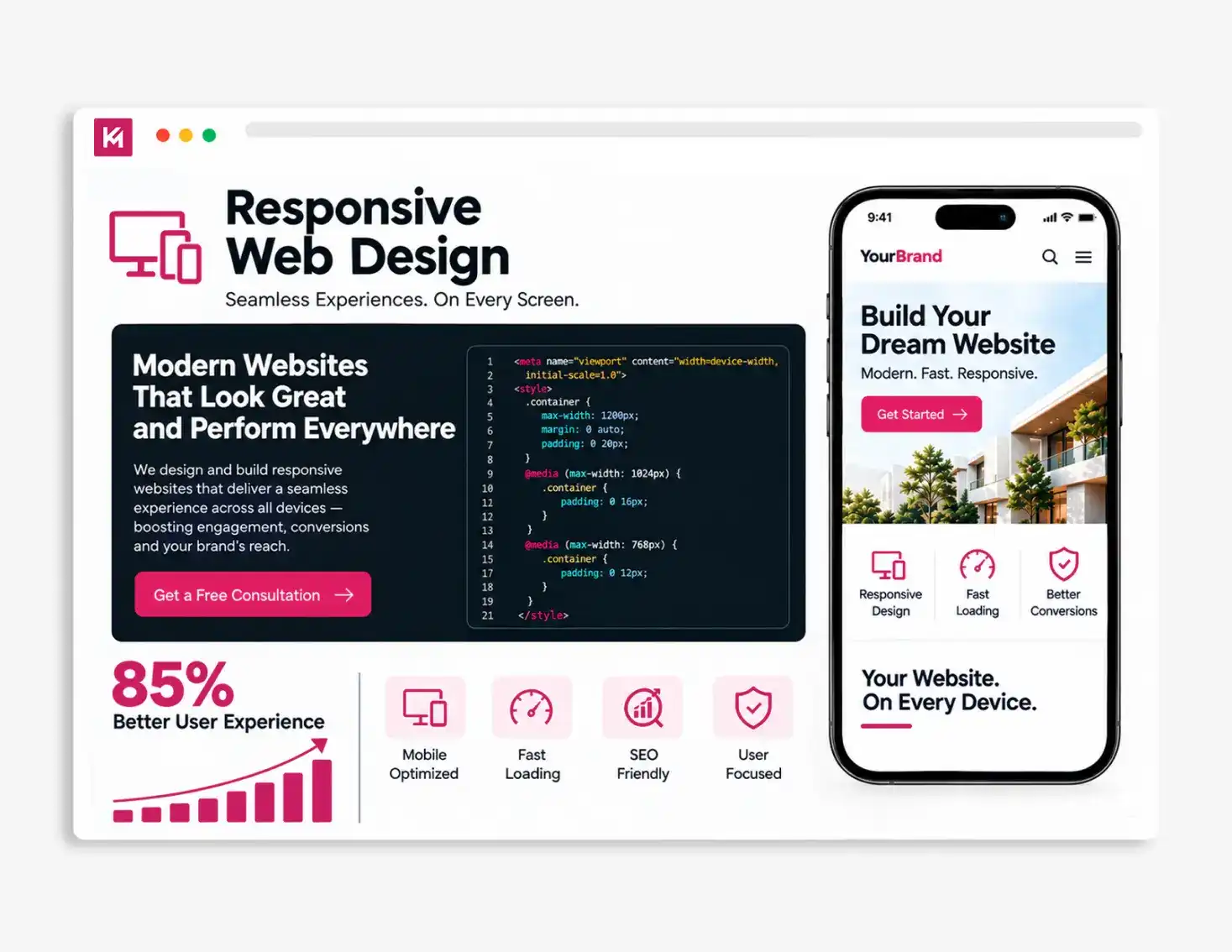
Responsive design isn’t valuable simply because a website fits a phone or an iPad. It’s valuable because customers can still find, understand, and act on your content when they switch devices. Today, if you are using a website which is not responsive, it can be negatively impacted by higher bounce rates, fewer visitors spending time, loss of traffic, lower conversion rates, and even impact your website’s search ranking.

We create stunning websites that adjust perfectly to every screen size.

Build fast, responsive pages that turn visitors into customers.

Deliver smooth mobile experiences that keep users engaged longer.

Ensure your website looks beautiful on desktops and other devices.

Optimize code to achieve higher search rankings on Google.

We design user-friendly, catchy layouts that work flawlessly.
What Your Business Gains From Responsive Web Design

Better User Experience (UX)
Give visitors a comfortable experience on phones, tablets, laptops, and desktops. Flexible layouts, readable typography, clear navigation, and touch-friendly buttons make it easier to browse, find information, and take action on any screen.

Faster Page Speed
A responsive website can load content more efficiently across different devices. Properly sized images, optimized page elements, and cleaner layouts help reduce unnecessary loading time and create a faster experience, especially for visitors using mobile devices.

Increased Conversions
Make it easier for visitors to complete important actions, no matter which device they use. Clear CTAs, easy-to-use forms, simple navigation, and mobile-friendly buttons can remove common points of friction and help more visitors move toward an enquiry, signup, or purchase.

Higher SEO Rankings
A professionally designed responsive website attracts more visitors to the site. In July 2024, Google also made it clear that if your mobile layout is broken, your search visibility disappears across all devices. This can indirectly point to the need to improve websites on mobile devices.

Lower Bounce Rates
Bounce rate represents the percentage of traffic or visitors who leave the website after viewing that one page only. Industry data reveals that 53% of mobile visitors will completely abandon a site if it takes longer than 3 seconds to load. Making your website responsive can reduce the increasing bounce rate.

Future-Proof Adaptability
Responsive websites need to be built with flexible layouts and reusable components that can adapt as your business grows. New pages, content, features, and screen sizes can be accommodated without relying on fixed layouts designed for only a few devices. When new device sizes or smart screens come out in the future, your site will automatically scale to fit them.
Responsive Web Design Services for Higher Growth
Custom Responsive Design
Mobile-first UI/UX Design
Cross-Device Website Testing
Custom Integration
Faster Page Load Speed
Ongoing Maintenance and Support
We build adaptive websites that are designed after understanding the business requirements. For many years, we have mastered designing custom-built responsive websites. Interactive layouts, user-friendly elements, smooth scrolling, easy navigation, and much more. All these contribute to a well-designed mobile-first site, which directly plays an important role in getting more high-quality leads and increasing the business ROI over time.
If you are looking for a custom responsive web design agency, then Kinex Media can provide you with market-demanding service and a team of professionals. Always remember that a business website made only for desktop users makes no sense for customers available on other devices.
My website is working well on desktop, but not on other devices. Can you help?
Absolutely. Kinex Media can help you customize a website that works smoothly on any device.
Contact UsTurn Mobile Traffic Into Customers With Responsive Design
Our team of experienced developers build websites that engage your visitors on any device. We eliminate the technical hurdles that kill conversions, giving your brand the competitive edge to capture more market share.


How Responsive Websites Impact Growth in Every Market

B2C
B2C consumers make buying decisions in seconds, usually on their smartphones. Our responsive websites capture that immediate intent by eliminating technical issues in the layout and simplifying navigation. We design effortless mobile interfaces that turn casual browsers into buyers, building instant brand trust and driving higher daily sales volumes.

B2B
Buyers in this market demand logic, speed, and easy access to complex data across all devices. Kinex Media ensures your case studies, forms, and service pages project enterprise-level authority whether viewed on a desktop or a phone. Our responsive platforms increase organic traffic, streamline long sales cycles and maximize your lead generation pipeline.

D2C
For D2C brands, your website is your entire customer experience. Since most D2C shopping happens on mobile, we engineer responsive designs that focus mainly on lightning-fast page speeds and seamless touch checkout flows. By removing any glitches during checkout or in the payment gateway, we keep shoppers engaged and drastically reduce abandoned carts.
Why Global Brands Choose Kinex Media?
If you have a website working perfectly on a desktop but your audience is mostly on mobile devices, then you are compromising your business growth. At Kinex Media, an award-winning web design agency, we bridge this gap by engineering custom, high-performance responsive solutions that put your mobile user experience first. By combining cutting-edge technical SEO with seamless multi-device testing and conversion-focused design, we ensure your website looks authoritative, loads instantly, and captures maximum revenue on every single screen.


Partnered and Delivered Results to 3000+ Brands


18+ Years of Experience Driving Measurable Results


Multi-Region Support for Global Brands

Dedicated Support and Maintenance



Aaron Crangle



I used Kinex Media to build my website and handle my SEO, and they have been terrific. Amir is responsive to all my questions, and the team delivers on what they promise. I highly recommend Kinex Media.














FAQs
Responsive web design is an approach where a website automatically shrinks, stretches, and rearranges its content to perfectly fit any screen size, such as a smartphone, tablet, laptop, or large desktop monitor. With over 60% of web traffic coming from mobile devices, a responsive site ensures you don’t lose potential clients due to broken layouts, tiny text, or hard-to-click buttons.
Google uses a system called Mobile-First Indexing, which means it only looks at the mobile version of your website to determine your search rankings. If your site isn’t fully responsive, is slow on phones, or hides important information on mobile screens, Google will drop your rankings across all devices. Our responsive designs are built from the ground up to satisfy all of Google’s strict mobile SEO requirements.
Everything we build at Kinex Media is uniquely custom-developed for your brand, whether your site runs on Shopify, WordPress, Magento/Adobe Commerce, or a Headless architecture. We do not use restrictive, bloated marketplace templates. Instead, our developers write clean, platform-optimized responsive code tailored specifically to your business logic. This gives you absolute design freedom, maximum security, and lightning-fast speeds while still leveraging the full power of your preferred Content Management System (CMS).
Yes. Mobile page speed is one of our top priorities. We optimize your website’s backend code, compress images into next-generation formats, and clean up background scripts so your pages load in under 3 seconds. This keeps impatient mobile users from hitting the “back” button and going straight to your competitors.
Before your website goes live, our quality assurance team runs rigorous cross-device automation and manual testing. We test your site across multiple real phone models (like Apple iPhones and Samsung Galaxies), various tablets, and major web browsers (like Safari, Chrome, and Edge). This guarantees your users get a flawless experience, no matter what device they prefer.



Get Your Free Growth Plan in 24 Hours
Award
Winning Agency
Performance
Focused Strategies
Seamless
Project Delivery
Proudly Recognized by Top Brands