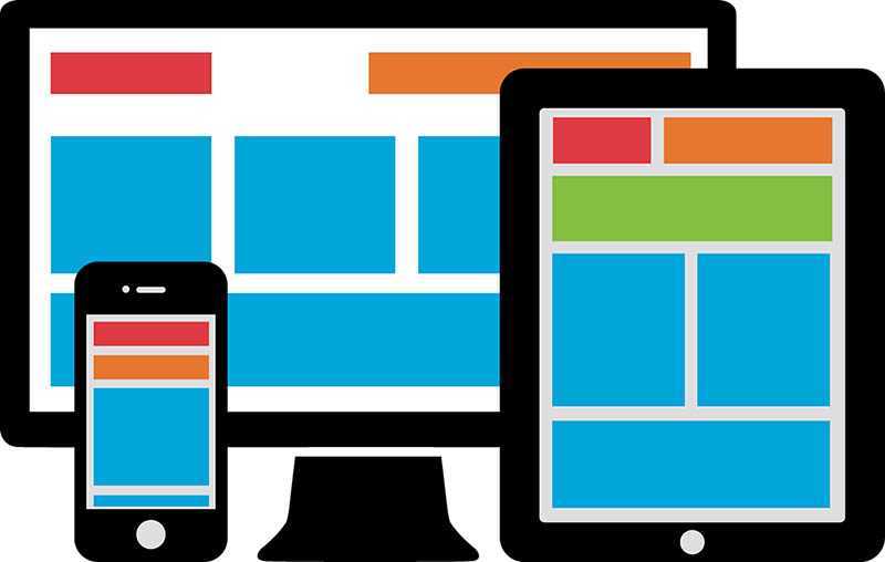
How Mobile Friendly Is Your Design
Smartphones and tablets have been around us for quite a time now. Considering the ease that these devices offer, more and more users are relying upon them for all, if not only the basic operations, over the internet. As per the statistics available online, maximum Google searches take place on mobile devices rather than computers.
Owing to the popularity of mobile phones, search engines like Google have already altered their search algorithms. Google recently came with an update where the mobile-friendly websites would be ranked higher. Also, sites that are not mobile-friendly would be penalized. Known as “Mobilegaddon”, some of the leading websites witnessed a significant drop in their rankings since the update. This is probably why most of the websites have taken a step towards improvising the mobile websites. But, not all of them manage to come out with something as impressive as others.
Website designers have to make sure that their mobile website adheres well by the search engine optimization tactics as well. Creating a website that looks pretty but fails to serve the user need would be of no use. You will need to create something that meets the requirement of the clients and eventually helps in garnering revenues for the website.
To make things clearer, here is a list of the top questions that you should consider while evaluating your mobile-friendly website:
Does it look good on different devices?
When talking about mobile-friendly sites, you do not have to limit the scope only to mobile devices. These include other devices such as tablets, as well. Technically, you will have to cover devices that range from 3″ screens to 7″ screens. You will have to check the compatibility of your website for all such devices. Earlier, websites used to specify separate URLs when accessing the mobile version of the site. However, it is best when you keep the layout responsive to your site.
How easy is it for the mobile users to complete the basic tasks?
Since the screen size for the mobile and related devices is smaller than the desktop, the main concern is to do justice to the input factor. Since touch is the primary input mode, in this case, you will have to make sure that you have eased out the tasks where the user has to fill in some forms. The purpose is to make it easier for the users to interact with your website regardless of the device you are utilizing. All you need to do is to take care of the basic things, such as making use of font size that is comfortable to read even on small screens or using icons that perform the desired action within a single click, hence improving the user experience.
What is the placement of your Call to Action?
For any website, the main goal is to increase user engagement and the overall revenue. For this, you will have to make it easy for the users to take the next course of action once they have selected a suitable service. It could be done while making use of clear and actionable CTAs (Call To Action). You will have to place the CTAs strategically over the top-right position of your home page, as this is the best position for making the CTA visible. The CTA might get re-positioned when viewed on a mobile device; also there are chances for it to get resized in an inappropriate manner where the user might fail to find the crucial input fields. Make sure you cross-check the layout and position of the CTAs.
Does your website have multi-level menus?
Gone is the time when adding three or four-level menus over the website was a common practice. Despite the trend being long gone, some sites still rely upon these web trends. Even though not all users appreciate minimalism website design and uncluttered navigation when creating websites for mobile devices; you have four-level for the minimalistic design only. You can use an icon at the top of the screen, clicking upon which the users can access the condensed menu. Make sure you get rid of multiple taps, lengthy scrolling, and never-ending lists.
How easily can the user return to the home page?
It is not always that once the user has traversed to the inner menus, he would end up purchasing the same product. There are maximum chances that the user would navigate to other products under the category. So, he would be leaving the category level where he is currently, and would instead move to some other hierarchy. The catch here is how easy it is for the user to find their way back to the home page. In most cases, the user expects to return to the home page while clicking over the website logo or some home button available over the top. If any of these is not present, they might get frustrated because of the continuous navigation and would prefer leaving the site.


