With the advent of new devices to access the internet, an important question that you can ask yourself is: “Is your website compatible across devices?” If your answer is no, you might want to solve this problem so as to remain relevant in your online business. To tell you the truth, a desktop-dedicated version of your website will not be able to cater to the unique needs of your users across devices. This is because every device differs in screen size and resolution, which can not be adjusted automatically with a fixed design.
You might have the opinion that the Fixed design is a thing of the past. But is it really? In this article, we will try to answer the commonly asked question, that is, which to choose from a Responsive web design and a Dedicated mobile site.
Let’s Commence!!
To give you a short and simple answer to the title above, it depends: on the priority of the online business. But to arrive at an answer, we first have to understand Responsive design and Mobile sites holistically.
What do you mean by Responsive Design?
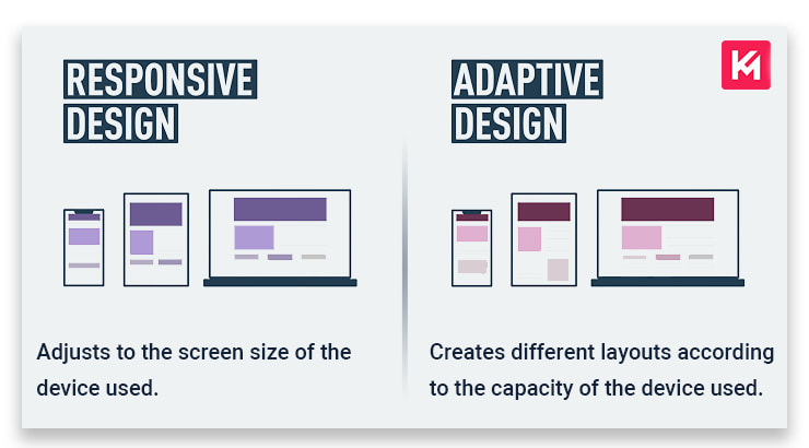
As the phrase suggests, a Responsive design is a design that aims to adjust the layout of your website depending on the size of the screen. This means that whether you access a website from a mobile phone or desktop, it will provide you with the same basic design and content. Amazing right? It aims to correct the problem faced by many trying to open desktop websites on mobile, which is the distorted layout of the website.
For Example, a Local Online business with a dedicated desktop website version must switch to a responsive design to attract the user coming from mobile searches. As you might know, people often use mobile devices to search locally and otherwise as well.
What do you mean by Mobile dedicated websites?
It is a website that is specifically designed for mobile devices. They are usually a subset of the desktop version and exist as a separate subdomain. The URL of a mobile website looks like this: https://m.example.com/. A dedicated mobile website aims to provide a tailored experience to the users by customizing the layout, features and functionality of the mobile website. It also takes into account having navigation and design that is responsive to the touch interaction by the users.
For Example, an ecommerce website targeting mobile shoppers must have a dedicated mobile website that loads fast and is easy to navigate for the users.
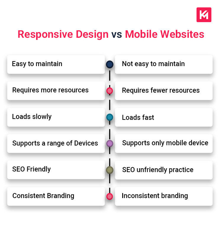
Responsive design vs Mobile Websites
| Responsive Design | Mobile Websites |
|---|---|
| It is easy to maintain a single website | It is not easy to maintain separate websites |
| It requires more resources to develop | It requires relatively fewer resources to develop |
| It often loads slowly due to the time taken to adjust the content of the website | It loads faster than its counterpart due to being a lighter version |
| It supports a range of devices due to its ability to adjust to different screen sizes | It supports only mobile devices due to its fixed design |
| It is SEO friendly as it offers a single URL and HTML code for Google to crawl and rank | It is not so SEO friendly, as having multiple websites can cause issues such as duplicacy |
| It helps create an image of consistent branding in the mind of your users | It does not create an image of consistent branding due to multiple websites having different web layouts |
| It does not integrate well with a separate independent backend service. For Example, Ticket booking service | It does integrate well with a separate independent backend service |
The main problem of the responsive design that you might have figured out by now is that it loads slowly as compared to a Mobile website. To solve this very problem, we have something called an Adaptive design.
What do you mean by Adaptive design?
It is a better version of a responsive design. With an adaptive design, the server detects the capacity of the device used to make a request and only sends the content which can feature well on that device. It basically creates different layouts for different screen sizes.
A well configured device will be served with more complex content enriched with CSS and javascript. In contrast, a less powerful device with a poor internet connection will be served with a lighter version of the same web page.
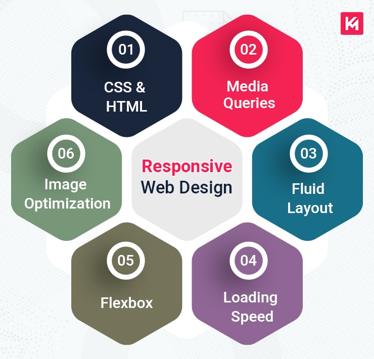
6 Important Elements of Responsive Web Design
CSS and HTML: It serves as the foundation of Responsive Design. They both, in combination, control the content and the layout of the web page.
HTML controls the structure, elements, and content of a web page, whereas CSS takes those aspects and makes them look beautiful. With them, you can control the content and the layout of the web page, respectively.
Media Queries: It helps you to render web pages depending on the different screen sizes used by the users to access your website. The big advantage of media queries is that the screen size or resolution does not have to be specified in the code of the web page for each device. By using media queries, you can create breakpoints at which the layout of your website changes to house different screen sizes.
Note: Breakpoints are used to tell websites to adjust according to the screen size of the device used.
Fluid Layout: A fluid layout is the key element of responsive design. It lets you auto-align the content of your website based on the screen size. It is done by defining areas of the page with the help of percentages instead of fixed pixels. This approach will automatically increase or decrease the different container element sizes based on the size of the screen. By utilizing a CSS grid or frameworks like Bootstrap, you can create a responsive design that automatically adjusts columns and spacing as the screen changes.
Loading Speed: The Loading speed of a website is an important factor for UX and SEO. From a UX perspective, if a website doesn’t load fast enough, it will lose the interest of the users, which will result in an increase in the bounce rate. This user’s behaviour will indirectly influence the ranking of the websites on Google search engine result pages. You can increase the speed of your website by inculcating the following practices:
- Reducing unnecessary characters, space or commas from CSS, javascript and HTML codes.
- Reduce the multiple redirects on your website.
- Enable Browser cache so that browsers do not have to load the entire page from scratch.
- Optimize the images with the right size and format to make sure they load fast.
Flexbox: It is a more efficient way to auto-adjust the content of the web page depending on the screen size. Even if the size of the content is not known, it takes care of the page rendering with respect to the device used. It allows the content to expand to fill up the free space or contracts to avoid clutter.
Image optimization: Image optimization is a must-step to have a website that loads in an instant with the click of the user. Websites that contain large-sized images result in slow loading of a website. You must be well aware that the loading speed of the web page increases the user experience of the user which in turn contributes to better ranking on SERP. This can be done by reducing the size of the image and selecting the jpeg format of the images to be included on the website. You can also use CSS media queries or SRCSET attributes to serve the most appropriate image size.
Final Words!!
Choosing between a Responsive website or Dedicated mobile requires careful consideration of the points discussed above. While the responsive design seems like it can be used to fit all devices, it has its limitations. Responsive design is slow to load as compared to mobile designated websites. From easy maintenance to SEO friendly, it comes with a lot of benefits to the website owners.
In comparison, a mobile designated website comes with a lot of flexibility. It gives website owners control over the design and content that they wish to show their users.
To choose between both, I think it comes down to the priority of the business involved. The main objective of mobile designated websites is to provide a tailored experience to their customers. If the online business is focused on catering to the needs of the local populace, a mobile designated website seems like a better option. But only if looking to have a single website to provide for the needs of the customer.
So, last, it depends on the priority of the website by which it can attract more customers to the business and is beneficial.
HOW MOBILE FRIENDLY IS YOUR DESIGN – Read This Article


