





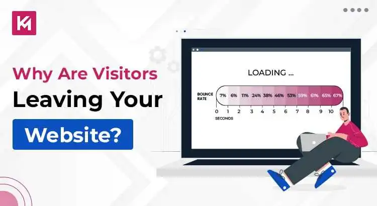
Why Are the Visitors Leaving Your Website?
Is your bounce rate going up despite investing time, effort, and budget into building a great site? Well, you’re not alone. The global median bounce rate is currently 47.4%, which suggests holding a visitor’s attention has become harder than ever.
As search behaviour keeps on changing, mobile performance standards are becoming even stricter, and analytics functions keep on evolving, what was essential a few years back isn’t necessarily crucial for your website these days.
If you’re wondering where your traffic is going, we’ll help you out. We will walk you through everything that you need to take care of to cut down your website’s bounce rate.
What to Note When Your Bounce Rate is Increasing
Is it Really a Bounce?
Before making major changes to your website, verify that the data you’re using gives you an accurate picture.
According to Google Analytics 4(GA4), a bounce is no longer just someone leaving after viewing one page. Instead, a bounce is strictly defined as an unengaged session. This further means that a visitor spent less than ten seconds on your site, triggered zero conversion events, and viewed fewer than two pages.
If a visitor lands on your blog post, reads it for two minutes, and leaves without clicking another link, GA4 counts that as an engaged session, not a bounce.
Is There Such a Thing as a Good Bounce Rate?
While there’s no exact benchmark, it’s unrealistic to achieve a zero bounce rate. Instead, we define a normal range within which a bounce rate may not be deemed a significant concern. Landing between 20% and 70% is common for websites and is generally acceptable. It’s worth noting that bounce rates can vary based on the visitor’s device. For example, mobile devices typically have higher bounce rates compared to desktops.
Is Your Content Relevant to What People Search for?
Search behaviour has changed dramatically. As AI summaries and search overviews are constantly delivering instant answers directly on search engine result pages, users who click through to your site expect hyper-specific, immediate value.
If your page is taking too long to get to the point, visitors will jump to another website without a second thought.
When a user lands on your page, the immediate area visible without scrolling, also called above the fold, must instantly help them validate that they are in the right place.
If someone searches for “best project management tools for agency teams,” landing on a page with a 400-word introductory background on the history of project management will result in immediate results. Instead, your top view should have:
- A Clear and Direct Headline: It should match the core search query intent.
- Immediate Key Takeaways: A TL;DR summary box, quick table, or a direct answer card can make it easier for the user to understand the content.
- Clear Content Hierarchy: A clickable table of contents allows users to jump directly to the specific information they’re looking for.
Is There Fluff in Your Content?
Apart from that, you should eliminate parts of content in the introduction that feel like “fluff.” Modern readers don’t read web pages word-by-word. They scan. To maximize engagement and keep visitors on the page, you need to do the following things:
- Lead With a Solution: Place essential conclusions, statistics, or recommendations early in the article instead of burying them at the bottom.
- Use Scannable Formatting: Break thick text blocks into short paragraphs, bullet points, essential feature callouts, and comparative tables.
- Offer Unique Information: Make sure that your content offers direct expertise, original insights, or practical examples instead of repeating generic definitions that AI tools are already answering on search pages.
Key Takeaway
If a visitor has to scroll past three paragraphs of generic intro text to find the actual solution to their search query, you’ve already lost them. Always match search intent with the first viewport fold.

Is the Website Responsive, Easy to Use, and Well-Organized on Mobile?
Google favours websites that are well-optimized for mobile devices, and it’s no wonder why: the number of mobile users is rapidly increasing. The market is adapting to provide websites that are easily accessible on phones. If your website looks great on a desktop but not on a phone screen, you’re losing a significant number of users.
A site is considered optimized when it responds to different screen sizes, is easy to use (with clickable elements), loads quickly, and has good interstitials.
According to a study by Google, mobile users dislike struggling with zooming in and out or dealing with cramped designs, often leading them to leave the site. If you’re uncertain about your design, you can use Google’s Mobile-Friendly Test. Simply enter the URL, and it will inform you if your website passes or not.
Ignoring mobile optimization can cost you more than you might imagine.
Do You Have Effective Conversion Points on Websites?

A well-designed website should guide users towards their goals with clear and actionable steps. A crucial element in achieving this is a strong Call to Action (CTA). CTAs cut to the chase, telling users what you want them to do next. This could be subscribing, trying for free, or buying something.
For example, your project management software offers a free trial. The CTA on the landing page could be “Start Your Free 14-Day Trial and Boost Team Productivity.” This clarifies the action (“Start Trial”) and the user benefit (“Boost Productivity”).
Have You Updated Your Design?
First impressions matter more than ever. When users land on your site, they form an opinion about your brand’s credibility within 50 milliseconds, faster than a blink.
Before a visitor reads a single headline, their brain analyzes your page’s overall visual structure, colour balance, typography, and spacing. By doing so, they get to decide whether your website looks safe or suspicious.
If your website feels outdated, cluttered, or difficult to read, visitors subconsciously think that it offers poor service, has security risks, or obsolete information.
Outdated signs that drive users away include:
- Overwhelming Layout Density: Cluttered sidebars, dense text blocks, and intrusive pop-up overlays can immediately cause cognitive overload. This prompts instant exits.
- Lack of Visual Comfort: Sites that don’t have clean spacing, responsive photography, or seamless dark mode support can cause visual fatigue in users who are browsing in low-light environments.
- Ignoring the Mobile-First Majority: If your desktop layout doesn’t adapt smoothly to small screens with touch-sensitive elements, you’ll be ignored by two-thirds of your audience.
According to a recent study by Statista, the percentage share of mobile users was 58.63% in Q4 of 2026, which makes it more important for you to optimize your site for smaller screens.
Tips for modernizing your visual credibility:
- Prioritize Micro-Interactions: Use clear visual feedback on clickable elements to make sure actions feel responsive and immediate.
- Streamline Navigation: You need to keep your menu bars simple and highlight 4-6 core destinations instead of overwhelming users with massive mega-menus.
- Reinforce Safety and Trust: Place modern trust signals like clean security badges(HTTPS), social proof, clear privacy statements, and verified customer reviews near action points like form submission and checkout zones.
Turn Bouncing Traffic Into Loyal Customers With Kinex Media
Users visit websites with their own intentions, and they may choose to leave for various reasons. However, when you notice a sudden increase in bounce rate, it’s important to consider all the aspects discussed above and ensure they are functioning optimally.
By addressing issues related to tracking accuracy, content relevance, mobile optimization, clear conversion points, and updated design, you can enhance the overall user experience and reduce bounce rates effectively.
Want to find out where your website is losing visitors? Kinex Media is here to help you out. Let our team analyze your site’s design, page speed, and tracking to build a personalized optimization strategy for your business.
Frequently Asked Questions
What is Considered a “Good” Bounce Rate in 2026?
A cross-industry median bounce rate sits around 47.4%, with top-performing websites maintaining a bounce rate under 36.1%. However, the engagement rate is around 52.6%.
How Does Google Analytics 4(GA4) Measure a Bounce Rate Differently Today?
In GA4, the bounce rate is strictly defined as an unengaged session that lasts under 10 seconds, triggers zero conversion events, and yields fewer than two pageviews.
What Page Speed Threshold Causes Website Visitors to Bounce Immediately?
Pages that take more than three seconds to load witness a sharp drop-off, with bounce rates jumping to nearly 49.3%.
Why do Mobile Visitors Bounce More Often Than Desktop Users?
Mobile sessions bounce at a significantly higher rate due to layout shifts, slower connection speeds, and aggressive pop-ups.
Is a High Bounce Rate on Blog Posts Always a Sign of Bad Performance?
No, blogs naturally bounce between 70-90%. It actually happens because search visitors often find their specific answers instantly and leave satisfied.

